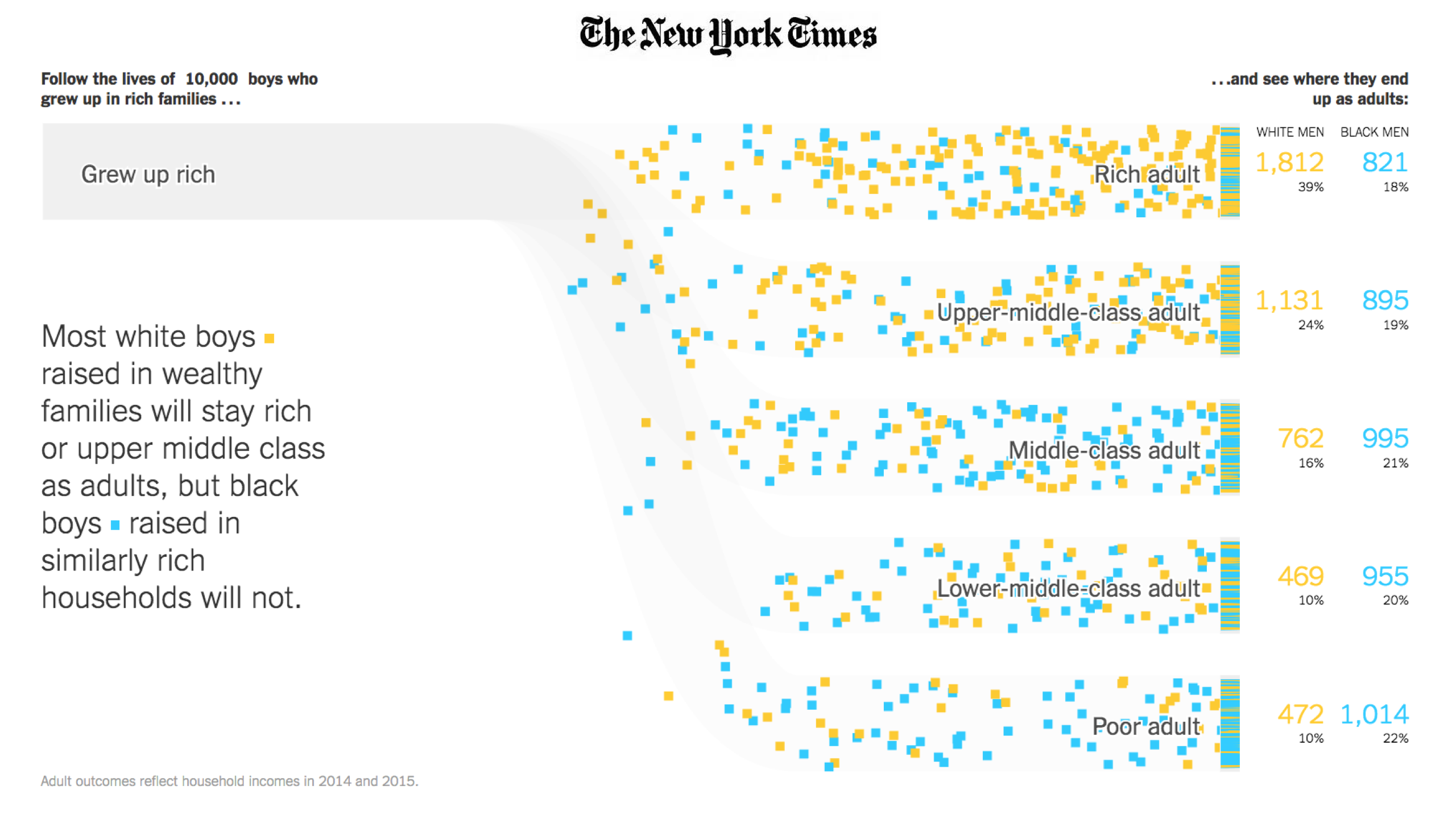
Currently, we create about 2.5 quintillion bytes of data every single day. It is estimated that by 2020 1.7MB of data will be created every single second for every person on the planet. Private companies, governments, think tanks and NGOs publish ever-bigger datasets within ever-shorter intervals. To ensure that the general public does not become distanced from societal issues and science, it is paramount that it understands the data and can interact with it. Visualising data, through infographics, charts or explanatory videos is an effective way to make data accessible and explain complex issues. Visualisation enhances stories as it allows the reader to easily verify and understand arguments made.

Compelling graphs can also help to increase engagement on social media and drive traffic to the corresponding articles. Research has shown, that humans are wired to process their environment visually. Generally, pictures are the best medium for the human brain to absorb information, which makes visual content an incredibly effective medium.

At Science in the Newsroom we’ve identified some of the most efficient and accessible tools that journalists and design teams can use to effectively communicate difficult concepts to their readers, increase engagement on social media and drive traffic to their articles.

Infographics

One of the most common ways to visualise data is by using infographics such as bar charts, treemaps and pie charts. Even though this is a rather simple way to present data, it can present information that can be often abstract and dry, in a very clear way, allowing the reader to absorb the information without much effort. Arguments can be easily verified, making the story transparent and simple to follow.

The New York Times often uses strong infographics such as the graphs explaining the punishing reach of racism for black males. The graphs and bar charts displayed in the article allow the reader to grasp the most important points of the story at one glance. Another great example of compelling infographics are the animated bubbles used by Hans Rosling’s Gapminder. The bubble graph shows how income relates to life expectancy across the world.

Both types of infographics can be created using Google spreadsheets which works very similar to Microsoft’s Excel programme. No coding skills are required. To set up infographics with Google spreadsheets you highlight the data and click the chart widget. Spreadsheets offer the regular customisation options such as changing colours, headings and scales.

Another easy to use tool is Datawrapper. It was built by journalists for journalists and does not require any coding skills. The tool’s fan base includes The Washington Post, The Guardian, Vox, BuzzFeed, The Wall Street Journal and Twitter. The layouts of the charts and maps can be customised and easily integrated in your news site. The tool is free, as long as it is only used ‘occasionally’ and the articles published do not get more than a 10,000 views per month.

Finally, there is ChartBlocks which is a user-friendly online tool that does not require any coding, and builds visualisations from databases, spreadsheets, and even live feeds. The chart is created in HTML5 by using the powerful JavaScript library D3.js. ChartBlocks allows its users to embed the created charts in any web page and to share it on Twitter and Facebook.

Interactive Visualisation

A more sophisticated way to present data is through interactive visualisation. It allows users to engage with data on a spatial and a temporal level. By enabling readers to set their own parameters and choose how it is presented, the user can ensure that the data is presented in a way that interests them most. Interactive visualisation is essentially an application on its own, giving it life outside the original story.

On top of being user-friendly, interactive graphs are a more effective means of communicating with readers. According to research by Marvin Milatz, people are better able to recall moving data, making stories that use interactive graphs more impactful and memorable.

What these could look like, was shown e.g. by Reuters in the scope of its fascinating project “Life in camps“. Reuters reported on the precarious living conditions inside the Rohingya refugee camps in Cox’s Bazar in Bangladesh. To document the rapid growth of the camp and its lack of infrastructure in the largest camp cluster, the journalists combined satellite imagery and data. The project won the award for best data visualisation at the Data Journalism Awards 2018.

One tool that allows users to visualise geographical data in an animated way is geoplotlib. This open-source library provides implementations of dot maps, spatial graphs, kernel density estimations and many more spatial visualisations. The library provides a nice collection of examples. However, be aware that the tool runs a bit bumpy and that it is based on piglet. Thus, python coding skills are required.

If you are looking for a tool that enables you to create animated graphs, Dash by plotly might be of great help. This more advanced web-based programme allows you to choose between 2D and 3D charts. Since it is built on the open source d3.js visualisation libraries for JavaScript, you can create your own programmes and features. The commercial package clearly increases user-friendliness and provides useful support.

Key take out

There are many reasons to use data visualisation in your story. There is a decent range of data visualisation tools available online to help you to enhance your report, many of which are free. While some of the more advanced programmes require coding skills it’s a good opportunity for collaboration across the newsroom especially for bigger pieces on long-term science trends.